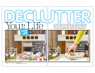
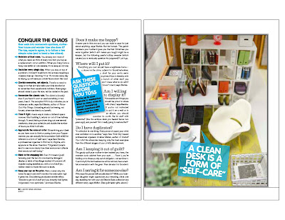
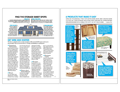
I am thrilled to share the results of some hard work and fun during some weeks in late December and early January. I hinted at something in this post, and I can now finally let you know that my photography and styling of a modern miniature interior is in the April 2011 issue of Ladies' Home Journal!
Back in late December, I was approached by Clare Lissaman, the photo director for the magazine, which, with a circulation of four million, is one of the more widely-read lifestyle publications in the U.S. She had seen my blog in the New York Times article from April 2010 and had an interesting idea for photography for an article they had planned on decluttering your home (and life). Could I create a very messy, messy interior in one of my dollhouses, and then neaten it all up? Could I come up with the concept for the room, style it, and then photograph both the messy and the neat scenes in an identical fashion? And could I complete it in a matter of weeks?
Y E S!
I felt very flattered and honored to be asked and really wanted to make the most of the opportunity. Once we had agreed that the main room in my Citadel would serve as the "set," I came up with the basic layout of the room (living area with office and small eating space), and turned to the article for inspiration. Some of the ideas that resonated with me were: use furniture such as an IKEA Expedit shelf for neat storage and display of items; select just some of your children's artwork and frame the pieces, instead of keeping every little scribble; use filing folders and other accessories to better organize your work space.
Inspired, I contacted Elisabeth Le Pla of ELF Miniatures, Doris Nathanson of minimodernistas, and Paris Renfroe of PRD Miniatures to purchase some key pieces of furniture and accessories. Each artisan worked very quickly to make and send their pieces by early January, and I set to work. I wanted to create the basics of the scenes and provide test shots to the magazine to ensure that everything was on track.
Here's a look at early iterations of the messy and neat rooms:
As you can see, my original concept was to have the messy room not have the final pieces that appear in the neat scene. The magazine thought it best to have identical pieces of furniture used in both scenes, and have their placement in the room match. In addition, I had to adjust the overall lighting, the color of the rugs, and had to photograph both scenes from the same exact angle. And the kicker: I was asked to hire a hand model to reach into the neat scene and provide a sense of scale. I hired one for an afternoon and crossed my fingers that her lovely hands would do the talking. I also worked on the lighting by putting a fixture on the roof and shining it on a board that reflected more natural light into the house.
My next efforts were more on target:
| LOTS of trial and error with the hand model -- and look at all that mess above and below! |
The final results:
| Only part of the hand model's arm made it into the final picture |
I finished the job in mid-January and have been on pins and needles waiting to see the final print copy, which hits the newsstands tomorrow; here's an advance pdf with web quality -- I hope to post an actual scan soon:
The online version is here. The nice folks over at the magazine did a blog post about the back story behind the story here -- check it out!
I am incredibly pleased with the outcome and am so happy that I was able to make a contribution to the issue. I am also grateful for Clare's faith in me and in this unique concept, and I hope to work with them in the future!
A BIG THANKS to everyone who has voted for Call of the Small for Best Miniature Blog in About.com's Readers' Choice Awards. Right now it is looking like I have a good shot at third place, but I'd appreciate your last votes today (if you haven't voted already) and tomorrow. The voting ends tomorrow, March 8.
Credits: I wanted to point out the lovely artisan work used in the scenes - thank you all! Desk and Expedit shelving by ELF Miniatures; Blanca TV shelving unit by PRD Miniatures; Long and Low couch, Japanese pillows, Eames Hang-it-All, globe lamp, and green rug in office by minimodernistas; the pink sparkly high heels in the foreground are by Patrizia Santi and were won in one of her giveaways. The Eames chairs are Reac; the table is vintage German; the side tables are from Fridas Fancy. There are countless accessories in the scenes and I know I will not be able to note them all, but the majority are by Re-ment, ELF Miniatures, AG Minis, Manor House Miniatures, Barbie by Jonathan Adler, Barbie, Liv, Nancy Tobey, Peppercorn Minis, Jazams, beads and craft store finds, and Lilu Shop on Etsy.


